AGILENT TECHNOLOGIES
Redesigning B2B user account for Agilent

My Role
Lead UX Designer
Defined the redesign direction across the portal
Led design decisions across multiple account features
Partnered with engineering to ensure scalable implementation
My Impact
Unified experience across multiple account areas
Improved navigation and task clarity
Enabled design system adoption
Reduced long-term design and engineering maintenance effort
Team
Product managers
Engineering team
Content team
UX/UI designers
tHE CHALLENGE
A critical product with no system behind it.
My Agilent is a core platform for Agilent customers to manage orders, licenses, invoices, and services.
Over time, the portal had evolved organically across teams and releases that led to the experience became fragmented, inconsistent, and difficult to scale.
The interface itself looked quite complex. Multi-level tables, overloaded settings, and minimal visual hierarchy. For existing users it felt familiar, but for new users it was confusing and unclear.
GOAL
Our goal was to make the interface user-friendly and align it with the new design system without disrupting the familiar workflow.

DESIGN STRATEGY
Clarity over complexity
Simplify dense, data-heavy workflows by prioritizing essential information, structuring content for fast scanning, and making actions obvious. Users should understand and act without effort.
Scalability by design
Leverage the design system to create reusable patterns that reduce variability, accelerate development, and support future growth of the platform.
System over screens
Unify all account experiences under one structure with shared patterns, components, and interactions. Every feature fits into a system, nothing is designed in isolation.
DISCOVERY
Analytics revealed that users are highly sensitive to changes in established workflows. They value flexibility, but not at the cost of familiar processes.
We started with an analysis of the product: mapped end-to-end user flows, conducted a UX audit, reviewed existing functionality, and gathered input from customers.
The audit confirmed a common pattern across B2B tools: interfaces overloaded with complexity, forcing users to spend time navigating instead of completing tasks. This helped us identify key friction points and shift the goal: not just improve the interface, but also keep the workflow familiar.


Responsiveness
Design System

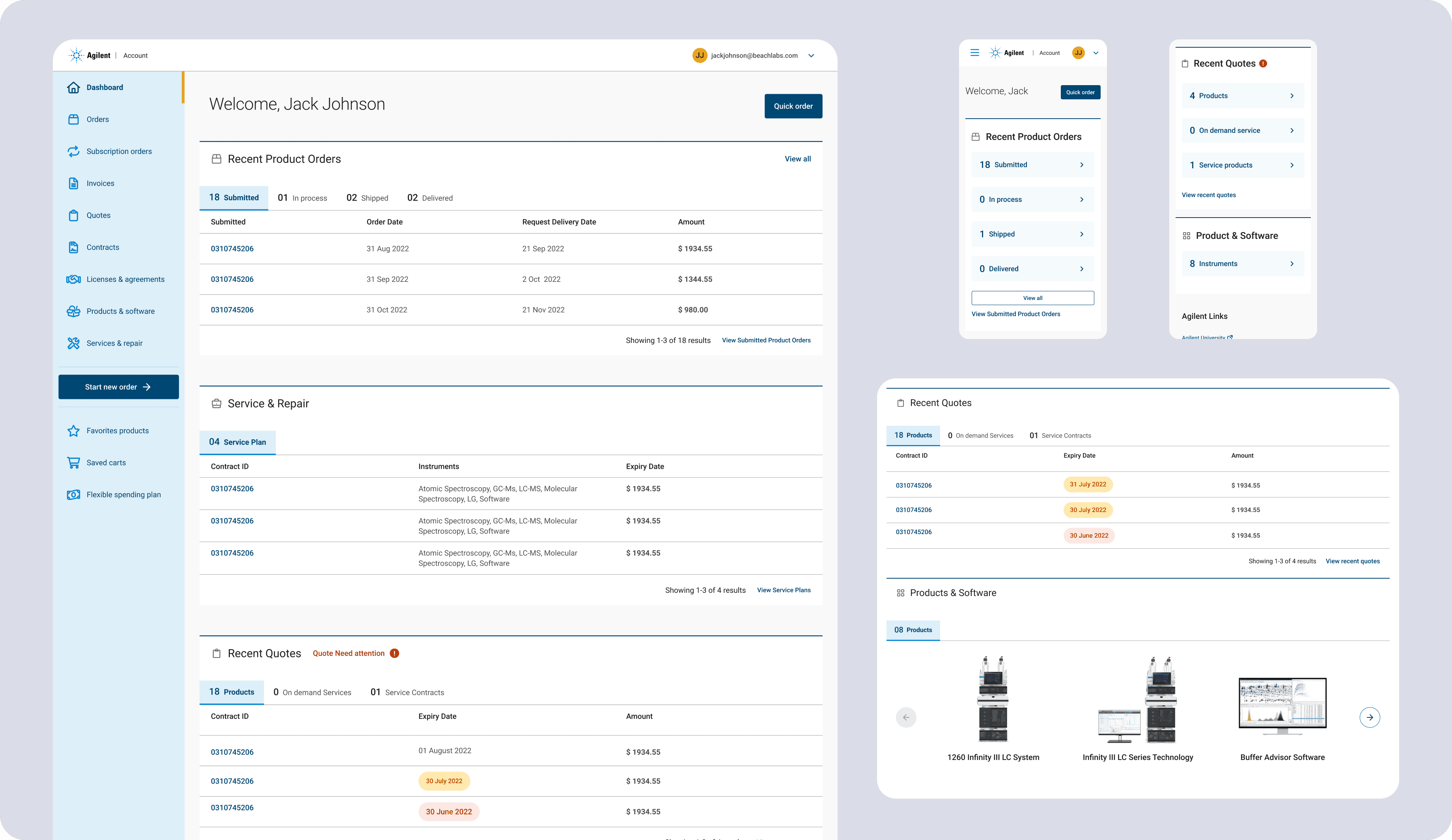
Dasboard

Quotes and Orders


Licenses and Services

